

It is frequently difficult to get a good photograph of an inscription. Some are badly worn and the lettering is indistinct; more often, the memorial is situated where the light is poor or where there is no room for the photographer to stand in front of the memorial to take the picture. As a result, the photograph may have a grossly distorted image of the memorial, or the image may be out-of-focus and the lettering too blurred to read, or part of the image may be "washed-out" by a flash and other parts so dark as to be almost black.
There is a lot that can be done to improve the readability of such photographs, using photo editing software such as Photoshop. The images below show the "before" and "after" versions of a photograph recently submitted. Note how how much has been recovered from the areas at the bottom of the picture which look completely black on the "before" image. Note also how the distortion caused by the camera looking up at the memorial has been corrected.
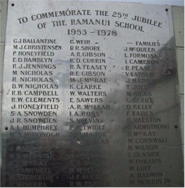 |
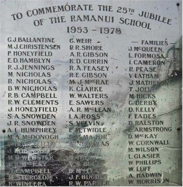 |
However, this takes time, effort, patience, and skill, and it's much better if the photograph does not need such work. The following hints and tips might be useful to those submitting photographs for this project:
As can be seen from the example above, there is frequently a lot of detail hidden in the dark areas of your photograph. Photoshop can bring this out, while keeping the contrast of the lighter areas of your photograph. For this reason it is often better NOT to use flash, since the flash light will wash-out the area it hits and destroy the detail in the image. Whereas the detail hidden in the dark areas can be brought out, there is no detail left in the over-bright parts of a photograph.
If you feel that flash is essential, it can be useful to take another photograph without it, and then use both later to try to reconstruct, if necessary, what was on the memorial.
The examples below show a brass plaque photographed (under difficult conditions) with flash, and you can see how the detail has been recovered from the dark areas but not from the light areas. In fact, in this example the martlets on the left-hand side of the shield were almost totally obliterated by the flash, and have been re-created by copying those on the right-hand side of the shield. You can do this with heraldic figures; you can't, of course, with lettering!
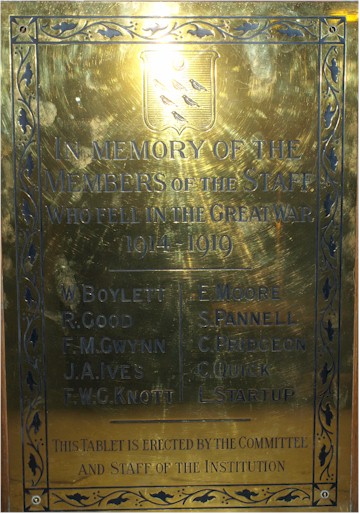
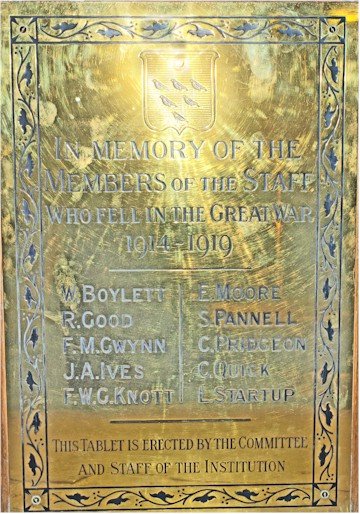
Image size is important, especially when scanning a printed photograph. If you have to do this, ensure you are scanning in colour if possible, and at at least 300 dpi. Printed photographs carry an enormous amount of detail, which will have to be captured by the scanning process; otherwise when magnifying the image it will simply scatter into individual pixels and the detail will have been lost.
Having said that, it's obviously true that a large file stored on the website will take longer to download than a smaller file. But do not let considerations of that sort affect what you send: it's part of my job as Indexes Administrator to reach a good balance between speed of downloading an image and the readability of that image on the web page.
When submitting a photograph, it's not strictly necessary to transcribe all the names into a spreadsheet to accompany the submission - but this can be helpful, especially if there are a lot of names or they are not very clear in the photograph. If you want to submit a spreadsheet with your photograph, then a spreadsheet form (with an example) is available.
Anne Shankland, Indexes Administrator
 © Guild of One-Name Studies
2013
This page was last modified
3 Feb 2026, 16:55
© Guild of One-Name Studies
2013
This page was last modified
3 Feb 2026, 16:55
Page owner: